Streamlining utilities ground movement assessments
Ground Movement Assessments (GMAs) involve analysing and mitigating the damage caused by construction related ground movement on strategic utilities, operational tunnels and historically important buildings. Gaining approval from owners of assets located in the densely populated areas around the HS2 Euston Station site, prior to construction works commencing, was therefore integral to the success of the project.
There are more than twelve thousand existing utilities within the HS2 Euston Station site. It is necessary to check the impact on assets at progressive construction stages and, in some cases, the results of the impact assessments directly influence the constructability of the proposed works. Therefore consistent and accurate reporting of utility assessments is imperative to identify the risk to utilities and inform the mitigation design. This, along with the large volume of assessments required at Euston, prompted the development of an automated system to increase efficiency and quality.
A Python script has been developed to automate the production of 1000+ page PDF appendix reports. The script captures the complexity of different utility owners’ acceptance criteria and is fully ‘customisable’ in terms of what output is required. The script utilises intelligent features, such as using a readable JSON (JavaScript Object Notation) file to manipulate model data, using graphical functions to plot charts and containing a user interface to improve usability.
The script provides a host of benefits, primarily improved accuracy and overall quality of the report produced. In one case study, the time required for an engineer to manually produce the appendix of results reduced from around fifty hours down to just ten. This time and cost saving will only increase as the station design is developed and further assessments are required. By automating a previously repetitive task, this has greatly improved team morale and satisfaction, which has ultimately led to a more collaborative and creative working environment. This way of working is becoming more commonplace across the industry, and this paper intends to bridge the knowledge gap and provide encouragement for more engineers to embrace a digital approach to their work.
- Written by
-
Ayrton Gill (Arup/SDSC)

- Resource type
- Resource type: Technical Paper
- Intended audience
- Private Sector Clients
Introduction to Ground Movement Assessments
A key aspect for the HS2 Phase One work is the redevelopment of Euston Station, as this will form the London Terminus. The highly complex station design is being delivered by the Euston Integrated Project Team (IPT) which comprises HS2 Limited, Mace Dragados Joint Venture (MDJV) and the SDSC (Stations Design Services Contracts – consisting of Arup / WSP JV and partners).
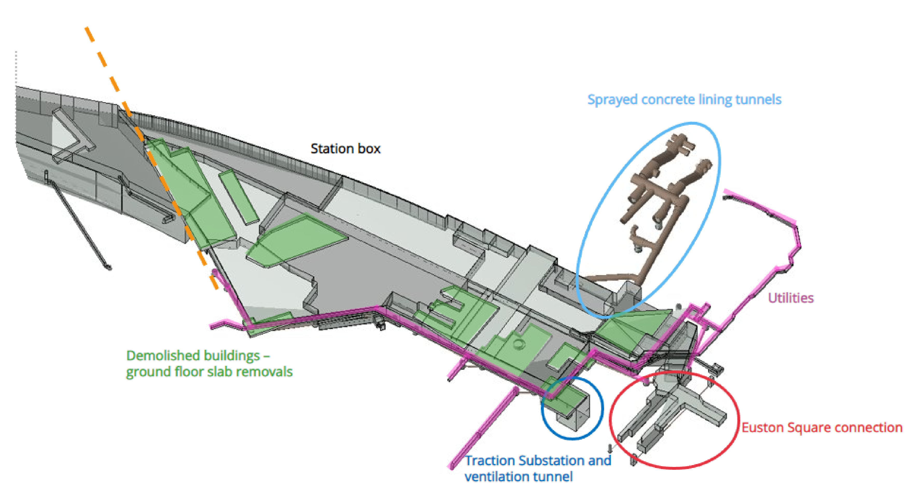
The redevelopment works include construction of a new station concourse, station box, basement level platforms, retaining wall installations, ventilation tunnels/shafts, substations, utility corridors, existing building demolition as well as integration with Euston Square Station and a London Underground (LU) interchange. Construction work at this scale and magnitude involves careful thought and planning of the construction process and sequence. Each of these construction steps involves some level of ground movement in the surrounding area. See Figure 1 for the main sources of ground movement (note this does not reflect the most up-to-date arrangement).
Furthermore, as the existing Euston Station is in a heavily urbanised area, there are several existing assets which may be at risk during and after the proposed construction works. These assets include 100+ year old LU tunnels, historically important and listed buildings, and thousands of existing buried utilities. All construction activities which result in ground movement necessitates a GMA to assess the impact on surrounding assets and provide suitable mitigation measures if required.
This paper will focus on the process for completing ground movement assessments that are required for the thousands of buried utilities surrounding Euston Station. These utilities provide major infrastructure services to the wider London area, with the main asset owners including Thames Water, Cadent Gas and UKPN. Several assets are highly critical and very sensitive to ground movement, such as Victorian brick sewers, trunk mains, high voltage cables and 36’’ diameter gas mains. The consequence of disruption or damage to these assets is substantial as there are many thousands of customers depending on these services. Moreover, it is carbon efficient to reduce the number of diversions or new installations that are required, therefore being able to prove that an existing utility can safely accommodate HS2 induced ground movement has an environmental benefit. As such, communication regarding the status of the assets to the client (HS2 Ltd), MDJV and asset owners becomes incredibly important. Frequent, accurate and clear reporting of the status of these assets not only improves the delivery of the design mitigation, but it also bolsters the relationship with MDJV and asset owners which enhances the collaboration process.
Utility assessment methodology and mitigation
The HS2 Technical Standard [1] for Ground Movement Assessments outlines a three-phased approach to mitigate the risk of ground movement on surrounding assets. The approach involves an empirical determination of likely ground movements during construction for phase 1 and phase 2, whereas phase 3 considers involves more detailed analysis and mitigation recommendations.
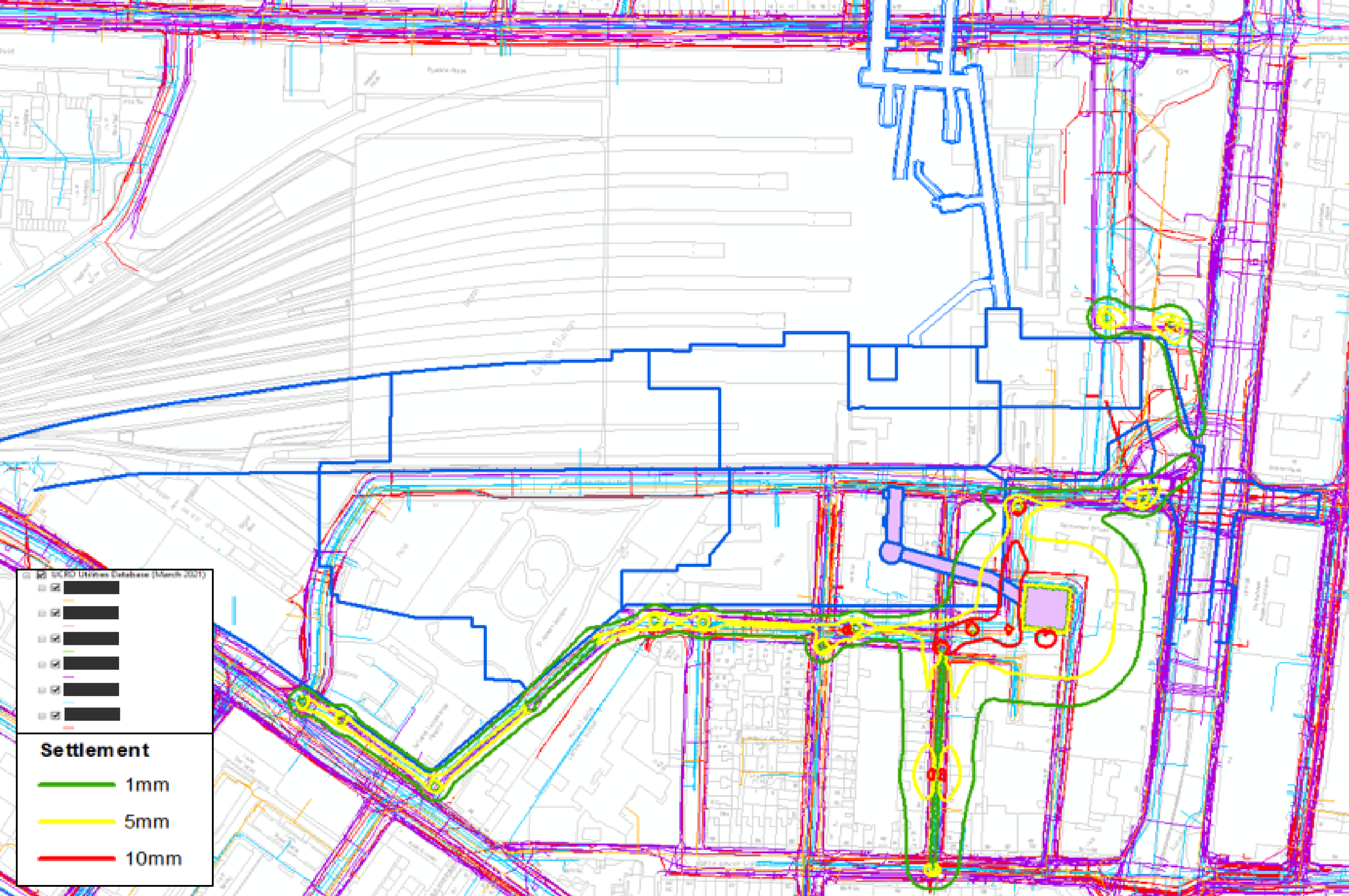
Phase 1 considers the magnitude of greenfield surface settlement and maximum ground slope only. All utilities within a 1mm Zone Of Influence (ZOI) are considered to exceed phase 1 and require a further detailed phase 2 assessment. This risk-based approach initially screens out utilities that will be unaffected by a construction activity. Figure 2 shows example surface settlement contours used to identify existing utilities located within the ZOI for the construction step being assessed (note some of the legend has been blanked and not all lines types are described).
The phase 2 assessment considers sub-surface ground movement and the subsequent strains experienced along the individual utilities. The HS2 standard outlines the relevant acceptance criteria. However, the asset owner’s criteria is followed where this is more stringent.
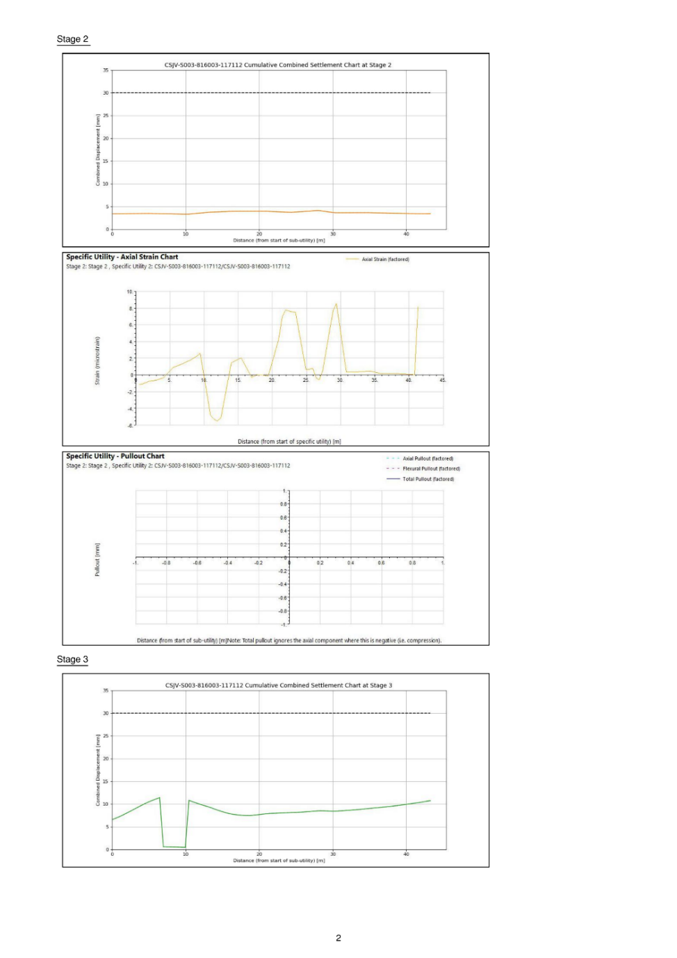
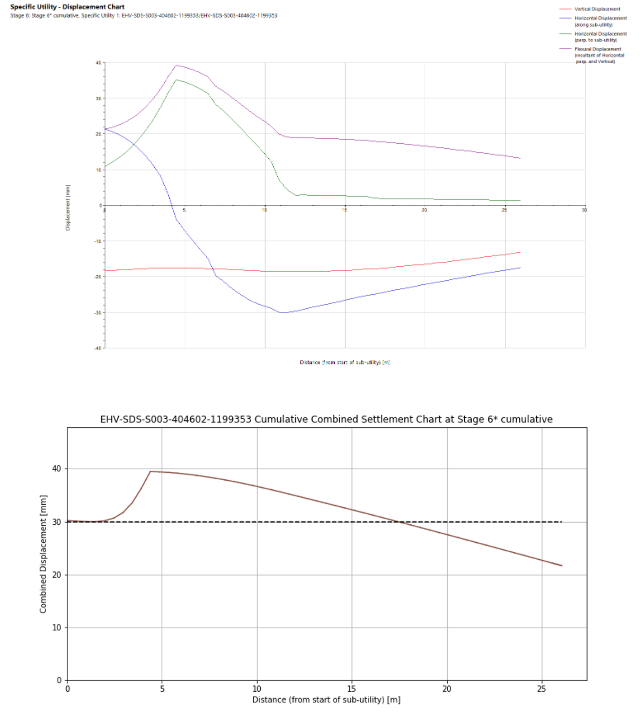
Oasys XDisp is used to calculate the ground movements and subsequent impact on surrounding utilities in accordance with the utility provider’s acceptance criteria. Charts showing displacement, strain, rotation, pullout, and curvature are plotted along each utility at each construction step. These charts form a key deliverable to the asset owner, as they enable them to understand the failure mechanism and verify SDSC’s conclusions and analysis. Therefore, as part of each GMA report, an appendix is produced detailing the necessary charts for each asset. An extract from an appendix previously produced is shown in Figure 3. In some cases, these appendices can be up to 1000+ pages long.
For assets exceeding phase 2, a more detailed investigation is undertaken to understand the cause of the exceedance. This includes reviewing the model and checking if there are any clashes with the proposed works or if there are any numerical modelling factors causing spikes in the ground movement curves.
If an asset is still exceeding the criteria after further review, then appropriate mitigation methods are proposed based on available guidance from the asset owners. This may comprise monitoring the asset during construction, re-lining, or alternatively diverting the utility. The GMA and subsequent mitigation must be accepted by the asset owners in time to prevent delays to the construction programme.
Scope for automation
As aforementioned, the results of the utility assessments may be used to inform the proposed construction sequence. These sequences are not fixed and are constantly undergoing refinement and design iterations. It is a challenge to keep up with the regular design changes as each iteration requires a re-assessment of all the existing assets. In some cases, the results of the utility assessment may directly influence the design due to stakeholder engagement, constructability, and commercial issues. The sooner the impact of the proposed works on existing assets is known and communicated to others, the easier it is to make design decisions and mitigate the risk of ground movement.
The creation of the appendix for phase 2 chart information was previously a manual, labour intensive excel-based process. The process was prone to human error, and it was difficult to achieve consistent formatting across all pages. Due to the repetitive nature of ground movement assessments for utility assets (that is, the same process of analysis is conducted for each utility for each stage of construction) a more automated approach was thought to be beneficial.
Having an automated method to produce the appendix reports would save significant time and enhance the quality of reporting during the design iteration phase of the construction sequence. Furthermore, asset owners often update their requirements in terms of what information they want to see, therefore it is important to have a flexible tool that can accommodate future changes. This has led to the development of a python script to automate this process, cutting down processing time and driving efficiency. The next section will explain the tool in more detail.
Digital implementation
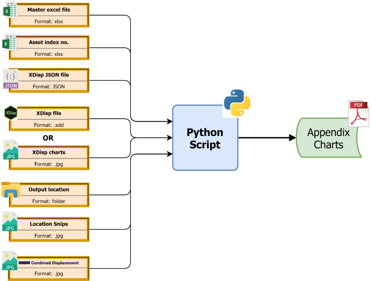
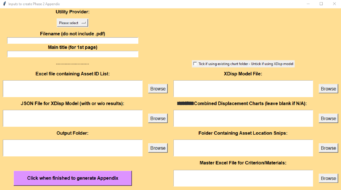
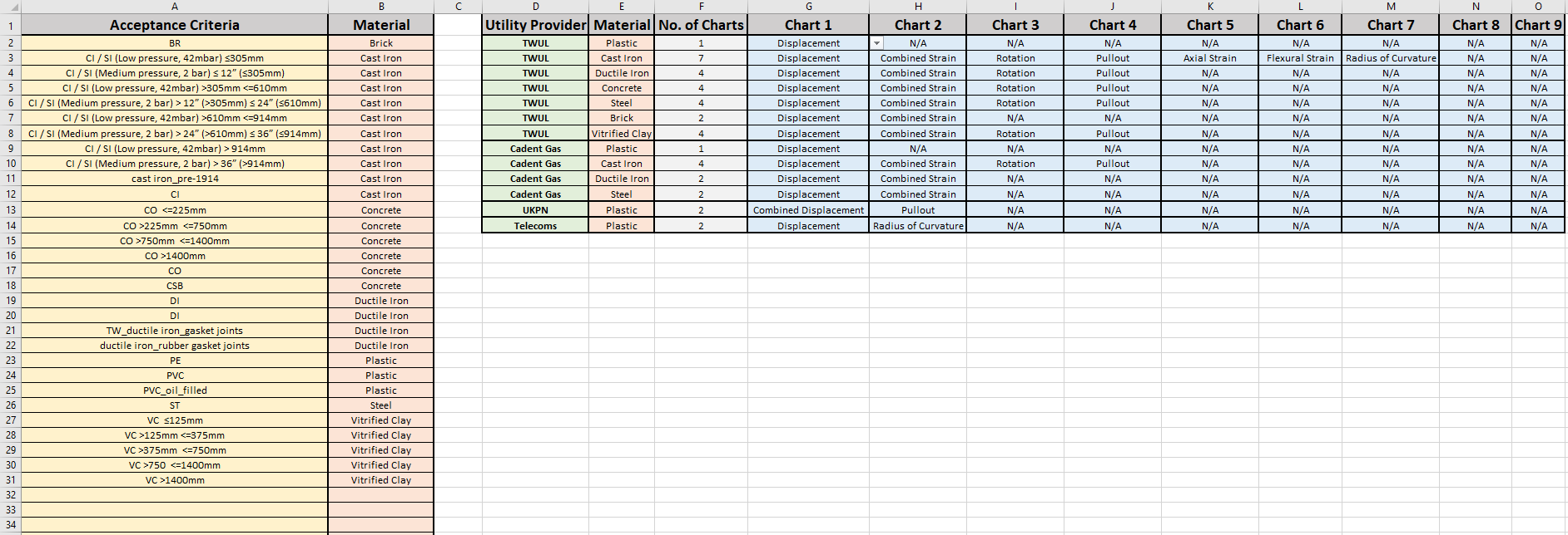
The tool developed is python based with a front-end GUI (Graphical User Interface) to improve the user experience. It incorporates various inputs of different filetypes, as well as dual functionality in terms of how the charts are produced. The final output of the script is controlled by a ‘Master Spreadsheet’ that controls which charts are output for a specific utility owner and pipe material. See Figure 4 for the appendix production workflow.
Figure 5 shows the GUI that is used to initiate the script. Figure 6 is the ‘Master Spreadsheet’ that controls the output of the appendix. Columns A and B describe a set of mapping criteria that converts a particular description in XDisp (column A) to the equivalent material type (column B). This list can be added to as and when acceptance criteria labels change, which they often do following utility database updates and on-site surveys. Columns D to O describe the specific requirements for each asset owner. The user can use the drop-down option to select which charts are required for each utility provider and material type. Despite the spreadsheet appearing to be capped to 9 charts, the logic within the script can work for any number of charts.
Methodology
This section provides a high-level summary of how the script works, as well as its development process. This is followed by a more technical explanation of various digital fundamentals that are used.
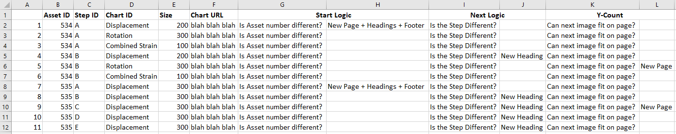
When developing any piece of code or automation, it is imperative that time is initially spent planning the structure and usability. From discussions within the team, where coding skills varied, it was agreed that any tool developed needed to be user-friendly for all abilities, be reliable, produce high quality output and be future proof. When it comes to deciding upon a coding language to use, there is generally no wrong answer. However, python was chosen as it is a versatile and commonly used coding language (for example, it is an official language at Google) which has great interoperability and a vast resource of open-source libraries that can be utilised. The next step was to ‘design the script’ and how it was going to work. Figure 7 shows the decision log produced when working out the script’s logic; much like technical engineering design, ideas usually start in a ‘rough and ready’ form. The basis of the logic was to compile a list of all the charts that needed to be printed in the correct order, and sequentially print each chart and appropriate heading one by one, each time evaluating how much space is left on the page (Y-count); if there isn’t enough space to print, a new page is inserted. This logic therefore satisfied the criteria of being flexible and robust to future design changes.
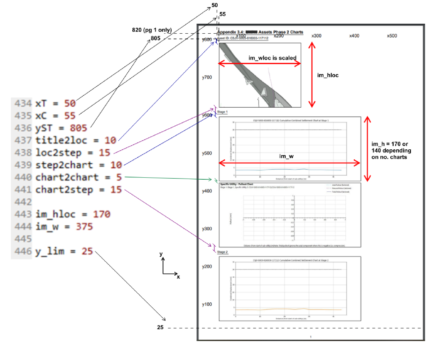
The JSON file is created from the XDisp model prior to running the script, and simply contains all the model data in a standard text format. It is used by the script to extract the specific assets that have been requested from the ‘Asset ID List’ spreadsheet and find out it’s acceptability criteria. This is mapped against column A and B in the ‘Master Spreadsheet’ to find the correct material type. As the script is run separately for each asset owner, there is enough information for it to use column D-O of the ‘Master Spreadsheet’ to find out how many and which charts are required for a particular asset. For the chart images, there is a tick-box on the GUI to allow the user to use the XDisp model directly to produce the charts (using the API – Automated Programming Interface), or to provide a folder directory location already containing the JPEG files. The script goes through each asset, reviews its requirements, and extracts from the JPEG files the file path for each chart. Once this preparation has finished, the script can begin looping through and printing each line. Through some initial planning and trial-and-error, each page was ‘curated’ to see what dimensions of titles and images would fit together sensibly. These parameters then became inputs to the script, allowing the user to adjust the formatting of the appendix however they choose. The utility owners often update their requirements for the specific formatting of the appendix; therefore this was an important consideration. The default settings are shown in Figure 8.
The image location is a screenshot that the user has taken from the XDisp model and saved into a relevant folder with the naming convention ‘Asset XX’ where ‘XX’ is the ID number that matches the main list.
The final input is the Combined Displacement charts for power cables. The combined horizontal and vertical displacement is calculated along each power cable (i.e. Square-Root-of-Sum-of-Squares) instead of the usual XDisp output that plots a separate line for each displacement direction. An additional python script that uses the JSON file of a model containing results is required to create new plots from the raw data using the plotting library ‘Matplotlib’ within python. See Figure 9 for a comparison of the XDisp output showing the vertical and horizontal displacement with the combined displacement output of the python script. If an appendix is being created for power cables, the running of this script and the folder directory produced for the combined displacement JPEGs is a prerequisite. This means the combined displacement charts are combined with the other charts produced directly from XDisp. This entire process of producing a 1000-page appendix report takes less than 2 minutes.
The following sections describe a few fundamental functionalities of scripting that are useful for anyone writing engineering code.
Graphical User Interface (GUI)
Figure 5 displays the GUI front-end for the python tool. It is created using a library called Tkinter, which is a python binding to the open-source, cross-platform toolkit called Tk. Tk provides functionality to build and compile various widgets such as buttons, menus, canvas’, text, frames, labels etc. The GUI built for this tool incorporates many of these widgets, as well as tick-boxes and drop-down menus. There are many other alternative GUI libraries that work within python, however Tkinter is python’s default GUI library and is included with the standard installs of python.
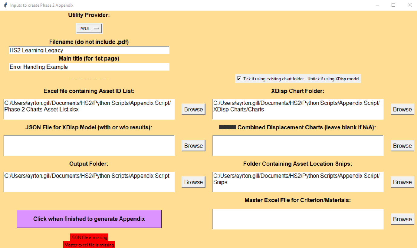
The usefulness of a GUI for any programme cannot be understated, especially when it is a tool to be used by many people. It provides a consistent display input that engineers can become familiar with the more the tool is used which builds an element of trust that the tool will deliver the expected results. Often having to scroll though lines of code is a complex task and inefficient; the GUI’s visual element creates a more interactive and user-friendly way of completing the task. Furthermore, it is an effective way of controlling the types of input that can be provided, thus eliminating mistakes. For example, each ‘Browse’ button in the GUI for this tool opens the file explorer, however the default file type display is relevant to the input such that if the location of the ‘Asset ID.xlsx’ is needed for example, only the .xlsx files will be displayed in the folder. This reduces the risk of a ‘bad’ input. An extension of this is the error handling capabilities. The GUI is designed by the programmer and thus can have ‘intelligent’ features. In this tool, when the ‘Go’ button is pressed, it completes a check of all the inputs to see if everything is provided and flags if and what inputs are missing. See Figure 10 for an example of this.
The feedback regarding the GUI from the users has been positive, especially in terms of practicality, ease-of-use, and functionality. When engineers are developing pieces of code, they should consider its final use case, and whether a GUI front-end would be a valuable addition.
JavaScript Object Notation (JSON)
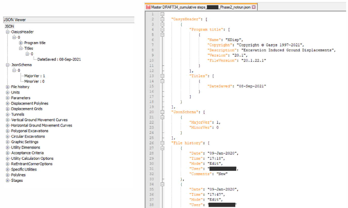
JSON files have been used in the appendix generation scripts. JSON is a standard text-based format for representing data in a structured way. It is a lightweight format that allows easy data-interchange between different software or web applications. Due to its text-based format, it can be read by almost any coding language. In Python, a JSON file is equivalent to a nested dictionary. A dictionary is a Python data type and is used to store data in a specific format in key-value pairs, e.g. {key:value}. This means to obtain a ‘value’ (which can be any datatype) the user must reference the ‘key’ (usually a string of text). A nested dictionary is when the ‘value’ is another dictionary, thus creating a deep structure of ordered data. See Figure 11 for an example of an XDisp JSON file previewed in Notepad++, which has a useful ‘JSON Viewer’ function to preview the data in a more user-friendly way.
Using a JSON file is a great way of reading, parsing, and manipulating data in a computationally efficient way. XDisp models can be created from scratch using a JSON file, and the same vice versa – this is applicable to many other software applications which is what makes it very versatile. As the data structure is always consistent, it is also possible to create databases or dashboards of information that extract data from multiple JSON files across different XDisp models, thus allowing for model tracking or data insights. In the appendix script, it is used to work out the acceptance criteria of each asset in the model, and to extract the number of construction steps being assessed.
Automated Programming Interface (API)
The term API is regularly used within the programming community, and it is one of the most powerful tools in an engineer’s digital arsenal. In simple terms, APIs allow for different applications to communicate with one another. It is a unique set of code that is usually documented that governs the access to the application. APIs are commonly used in a web-based environment, for example if a site needs to process an order and confirm payment via a payment service, or if products from another retailer are being sold and there needs to be real-time price updates.
However, there are several types of APIs, and a common form is called COM Automation (Component Object Model). This is developed by Microsoft, and it allows for commands to be issued from a separate process such as a set of Python code but could be a VBA (Visual Basic for Applications) script called from a spreadsheet also. The Oasys XDisp installation provides documentation for the various functions callable from the COM interface. In the tool that has been developed, the user can provide the file path for an existing XDisp model (.xdd file) and, using the COM interface, the Python script ‘opens’ the model and exports all the charts into a folder of choice – much like using the dropdown menus within the application itself (File > Export Charts etc).
Using APIs are powerful as it allows the programmer to begin to connect different applications and processes, which are essential for creating automated workflows. In this instance, it is being used to execute a discrete isolated task. However, the principles used can be expanded to begin to pull and push data through applications. Engineers often need to analyse models and extract results for processing. This is all possible using APIs, and they provide a consistent and reliable process that can be the foundation of an automated workflow.
PDF Reporting
Figure 8 demonstrates the ‘curated’ final page and formatting of the appendix. This was developed using a an open-source library called ReportLab written in Python. It allows users to ‘draw’ PDF pages, thus allowing for complete flexibility on the page. Often coding for an engineering use-case involves csv files and swathes of data; however, programming can be incredibly versatile and produce a wide range of solutions such as this one. This tool incorporates many different types of data formats, applies some ‘logic’, and produces a finished document – principles that can be taken forward into many different applications.
The advantages of a digital approach
With computing power at an all-time high, and project programmes as fast paced as ever, embracing digital tools is essential. Tools should be used to supplement and enhance engineering judgement and logic, rather than replace them. If used correctly, the benefits of a digital approach are multi-faceted.
A digital approach provides an opportunity to improve the quality of work delivered, and often vastly increases time efficiency. Leveraging the power of computers, calculations and iterations can be completed 1000s of times in seconds – which pays dividends when there is a vast amount of data to process, and usually allows the user to converge on a better solution. In this tool, there is no engineering calculation as such, but the tool allows the user to generate large amounts of data with the confidence that the computer has a 0% error rate (providing inputs are all correct), compared to the small probability of human error.
Comparing the run time of the new tool compared to the original method, assuming the final review time by a senior engineer was the same for each, the time saving per GMA is approximately 1-2 full weeks of an engineer’s time. When this is scaled to account for the various iterations of a design and future GMAs; the time and cost saving will be significant.
An additional benefit from having a digital approach is that when more repetitive, mundane tasks are automated, it unlocks more time for the engineer to spend their efforts solving the design problems of the project. Automation should not replace the engineer’s competency, but when used wisely it can bolster an engineer’s way of working and performance which ultimately delivers better solutions to clients. One drawback of taking a digital approach is the start-up cost and upskilling process. It must be a conscious leadership decision to invest the time to create a tool and allow engineers to learn the skills required. Developing a digital tool is usually financially beneficial over time; however, even if the financial gains aren’t significant, for what you gain in quality assurance and job satisfaction for the engineer are plentiful.
Scope for future development
The tool described in this paper is an example of what is achievable using a digital approach. It is by no means the final development on the project, and principles from this can be applied to future work to further streamline the process. For example, the use of COM Automation with XDisp could be developed to complete more calculation heavy data processing to help complete utility assessments. An ambitious but feasible idea is to use ArcGIS APIs to create a data flow between XDisp analysis results to a visual plotting software. This could generate contour plots/heat maps of the behaviour of different utilities to give a deeper graphical insight into the behaviour of the utilities due to different construction activities. These are just a few examples, but it demonstrates the point that once a few fundamental skills are gained, the possibilities for development increase.
Conclusion and learning legacy
A digital tool has been developed that automates the production of large appendix reports for utility owners to evaluate the impact the construction work has on their assets and issue approvals for the works to commence. The tool utilises a multitude of data types and formats within one programming environment, whilst providing a front-end GUI to improve the usability of the script. It begins to create a connection between different software packages using APIs, a feature that is integral for a scalable workflow.
The benefits of the script include enhanced quality of the deliverable output and significant time saving. Using a logically designed script there is 100% reliability that the produced output is error free, whilst maintaining flexibility to future requirement changes. This robustness is essential in creating a useful digital tool for the future.
Data processing and manipulation is becoming a key skill for engineers. The ability to perform calculations or produce reports using multiple data sets and software packages can bring time efficiencies and quality benefits to a project. Therefore, upskilling in these digital areas is vital. Technical managers should identify opportunities to innovate and to streamline workflows, increase efficiencies, whilst improving the quality of work.
This paper demonstrates some core digital principles that can be taken away and applied to not only utility ground movement assessments but any task that involves repetitive iterations and manipulation of large datasets.
Acknowledgements
The author would like to acknowledge the contribution of the SDSC Asset Protection Team for guiding the design and production of this tool, and always being on hand for essential testing, debugging and advice.
References
[1] High Speed 2 Ltd (2019) HS2-HS2-TN-STD-000-000005 – Ground Movement and Assessment from Below Ground Construction
Peer review
- Rick HartwigInstitution of Engineering and Technology